
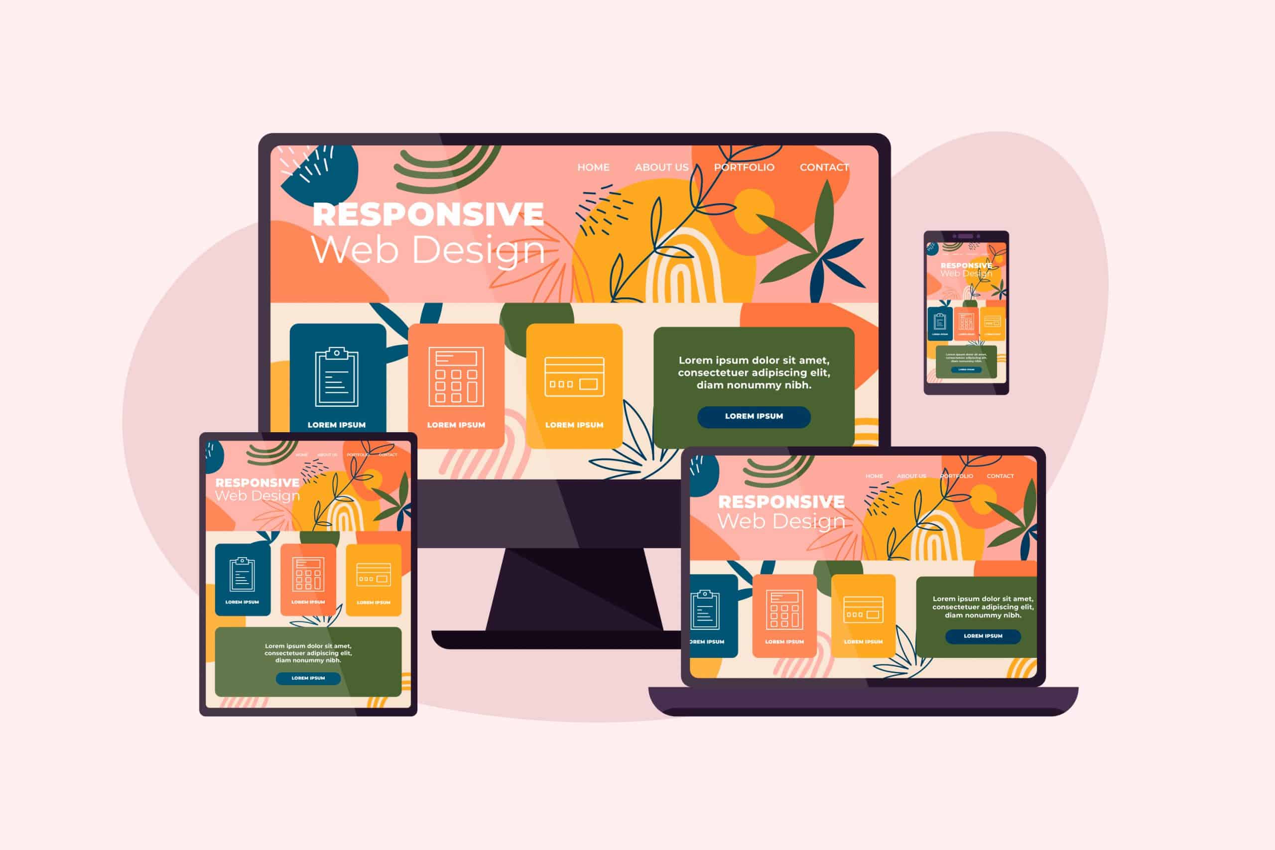
Responsive design is no longer optional, it’s a necessity. With users accessing websites from smartphones, tablets, laptops, and desktops, delivering a seamless experience across all devices is critical. Traditionally, developers have relied on CSS for responsive design by writing custom media queries that target specific screen widths. While effective, this method often leads to bloated, fragmented codebases that are hard to manage, scale, and debug.
Enter Tailwind CSS, a utility-first framework that transforms how developers handle responsive design. By embedding responsive utility classes directly into HTML elements, Tailwind eliminates the need for separate media query files. The result is faster development, centralized styling, and a cleaner codebase.
At Sreyas IT Solutions, we specialize in building modern, scalable web and mobile applications using frameworks like Tailwind CSS, React, and Flutter. Our experienced frontend developers have implemented responsive UI designs for clients across the US, UK, Europe, and the Middle East, delivering sleek, high-performance interfaces that adapt perfectly to any screen size. We follow best practices in responsive development, ensuring every application we build is accessible, visually appealing, and easy to maintain.
Traditional CSS Media Queries
In the traditional approach, developers apply CSS for responsive design using custom media queries that define different style rules based on screen size.
Example:
.button {

  padding: 8px 16px;

}

@media (min-width: 768px) {

  .button {

    padding: 12px 24px;

  }

}

@media (min-width: 1024px) {

  .button {

    padding: 16px 32px;

  }

}
Problems with this method:
- Styles are spread across multiple files.
- Code becomes repetitive and harder to maintain.
- Updating responsive behavior requires finding and editing different places.
Tailwind CSS Approach
Tailwind CSS streamlines responsive design by allowing developers to write screen-specific styles directly within HTML elements using breakpoint prefixes.
Example:
<button class="px-4 py-2 md:px-6 lg:px-8">

  Click me

</button>
Here:
- px-4 py-2 applies default padding.
- md:px-6 applies new padding for medium screens and up (768px+).
- lg:px-8 applies even larger padding for large screens and up (1024px+).
Benefits Tailwind CSS:
- Code stays clean and centralized.
- No need to write separate CSS files or media queries.
- Faster updates and simpler readability.
Built-in Breakpoints
Tailwind CSS provides default screen breakpoints:
| Prefix | Min Width |
| sm: | 640px |
| md: | 768px |
| lg: | 1024px |
| xl: | 1280px |
| 2xl: | 1536px |
You can customize these breakpoints easily inside the tailwind.config.js file if needed.
Why Tailwind is Better
- Cleaner Code: Responsive styles are written next to the elements they style.
- Simpler Structure: Less confusion and fewer separate files.
- Built-in Responsiveness: Breakpoint prefixes make responsive design effortless.
- Faster Development: Avoids repetitive media query writing.
- Easy Maintenance: Makes future changes smoother and quicker.
Conclusion
If you’re looking for a modern, efficient way for responsive design, Tailwind CSS is the ideal choice. It empowers developers to build fast, responsive, and maintainable web interfaces with minimal effort.
We leverage Tailwind CSS to deliver fast, responsive, and visually appealing web interfaces tailored to client needs. Whether you’re revamping an old site or building a responsive web app from scratch, our team ensures your product looks great and performs flawlessly across all devices.
Let us help you build a better frontend—faster and smarter.