Responsive web design is essential in today’s digital landscape, ensuring that websites look great on all devices. CSS Grid and Flexbox are two powerful CSS layout systems that help achieve this. This blog post will explore both techniques and demonstrate how to implement responsive designs effectively.
Understanding CSS Grid
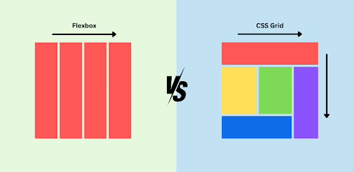
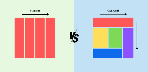
CSS Grid is a two-dimensional layout system that allows you to create complex layouts easily. With Grid, you can define rows and columns in a container, placing items anywhere within that grid.
Example: Basic Grid Layout
Here’s a simple example of a responsive grid layout:
HTML
<!DOCTYPE html>
<html lang="en">
<head>
    <meta charset="UTF-8">
    <meta name="viewport" content="width=device-width, initial-scale=1.0">
    <link rel="stylesheet" href="styles.css">
    <title>CSS Grid Example</title>
</head>
<body>
    <div class="grid-container">
        <div class="item1">Item 1</div>
        <div class="item2">Item 2</div>
        <div class="item3">Item 3</div>
        <div class="item4">Item 4</div>
    </div>
</body>
</html>
CSS
/* styles.css */
body {
    margin: 0;
    font-family: Arial, sans-serif;
}

.grid-container {
    display: grid;
    grid-template-columns: repeat(auto-fill, minmax(200px, 1fr));
    gap: 10px;
    padding: 20px;
}

.grid-container > div {
    background-color: #f1f1f1;
    border: 1px solid #ccc;
    padding: 20px;
    text-align: center;
}
Understanding Flexbox
Flexbox is a one-dimensional layout system that allows items to align and distribute space within a container, making it ideal for layouts that require dynamic sizing and spacing.
Example: Basic Flexbox Layout
Here’s how to create a responsive layout using Flexbox:
HTML
<!DOCTYPE html>
<html lang="en">
<head>
    <meta charset="UTF-8">
    <meta name="viewport" content="width=device-width, initial-scale=1.0">
    <link rel="stylesheet" href="flexbox.css">
    <title>Flexbox Example</title>
</head>
<body>
    <div class="flex-container">
        <div class="flex-item">Flex Item 1</div>
        <div class="flex-item">Flex Item 2</div>
        <div class="flex-item">Flex Item 3</div>
        <div class="flex-item">Flex Item 4</div>
    </div>
</body>
</html>
CSS
/* flexbox.css */
body {
    margin: 0;
    font-family: Arial, sans-serif;
}

.flex-container {
    display: flex;
    flex-wrap: wrap;
    gap: 10px;
    padding: 20px;
}

.flex-item {
    background-color: #4CAF50;
    color: white;
    padding: 20px;
    flex: 1 1 calc(25% - 10px); /* Adjusts for 4 items in a row */
    text-align: center;
}
Responsive Design with Media Queries
Both CSS Grid and Flexbox can be enhanced with media queries to ensure that your design is responsive across various screen sizes. Here’s how to add media queries to the examples above.
Media Query for Grid
CSS
@media (max-width: 600px) {
    .grid-container {
        grid-template-columns: 1fr; /* Stacks items on small screens */
    }
}
Media Query for Flexbox
CSS
@media (max-width: 600px) {
    .flex-item {
        flex: 1 1 100%; /* Stacks items on small screens */
    }
}
Conclusion
Mastering CSS Grid and Flexbox is crucial for modern web development. Both layout systems provide powerful tools for creating responsive designs that adapt to different screen sizes. By combining Grid and Flexbox with media queries, you can build visually appealing and highly functional layouts.

