
Introduction
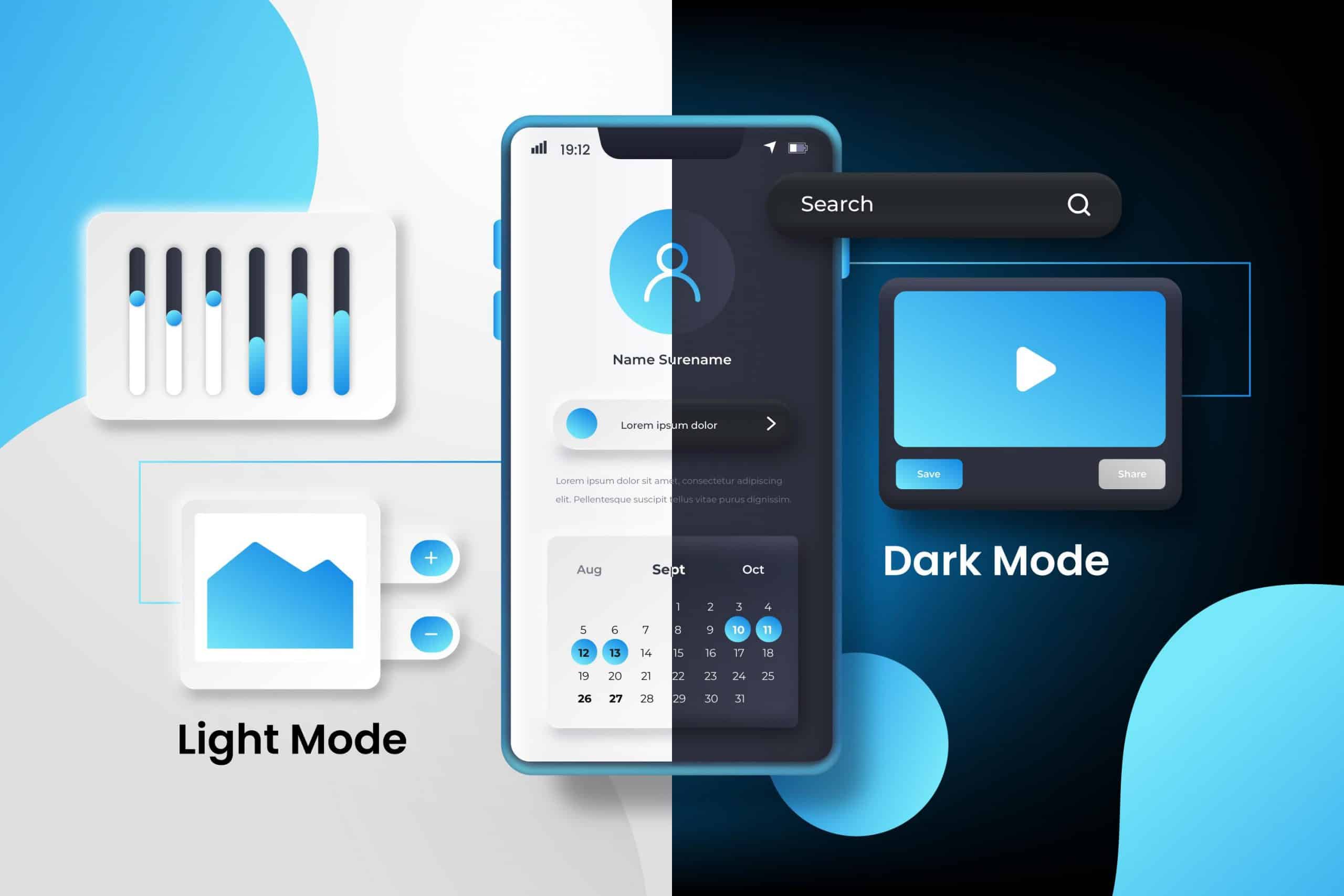
This article explains theme switching in React apps, allowing users to toggle between dark, light, and auto modes, improving UX and accessibility.
Steps to Implement Toggle Theme in React App.
1. Set Up the React Application
First, create a new React application using the Create React App or any other setup you choose.
npx create-react-app theme-switcher
cd theme-switcher
npm start
2. Define CSS Variables for Themes
Create a CSS file to define the variables for toggle/ light and dark themes.
/* src/themes.css */

:root {
  --background-color: #ffffff;
  --text-color: #000000;
}

[data-theme="dark"] {
  --background-color: #000000;
  --text-color: #ffffff;
}

body {
  background-color: var(--background-color);
  color: var(--text-color);
}
3. Create the Theme Context
We will use the Context API to manage the theme state across the application.
/* src/ThemeContext.js */
import React, { createContext, useState, useEffect } from 'react';

const ThemeContext = createContext();

const ThemeProvider = ({ children }) => {
  const getInitialTheme = () => {
    const savedTheme = localStorage.getItem('theme');
    return savedTheme || 'light';
  };

  const [theme, setTheme] = useState(getInitialTheme);

  useEffect(() => {
    localStorage.setItem('theme', theme);
    document.body.setAttribute('data-theme', theme);
  }, [theme]);

  return (
    <ThemeContext.Provider value={{ theme, setTheme }}>
      {children}
    </ThemeContext.Provider>
  );
};

export { ThemeProvider, ThemeContext };
4. Create a Component to Toggle Theme in React App
Create a component allowing users to toggle between light, dark, and auto modes.
/* src/ThemeToggle.js */
import React, { useContext } from 'react';
import { ThemeContext } from './ThemeContext';

const ThemeToggle = () => {
  const { theme, setTheme } = useContext(ThemeContext);

  const handleThemeChange = (event) => {
    setTheme(event.target.value);
  };

  return (
    <div>
      <select value={theme} onChange={handleThemeChange}>
        <option value="light">Light Mode</option>
        <option value="dark">Dark Mode</option>
        <option value="auto">Auto (System Preference)</option>
      </select>
    </div>
  );
};

export default ThemeToggle;
Conclusions
By following this guide, you have implemented a robust theme switcher in your React application, allowing users to toggle theme in React Apps between light and dark modes and an auto mode that respects their system preferences. This enhances user experience by providing customizable appearance settings, ensuring that your application is accessible and visually appealing to all users. The combination of CSS variables, Context API, and a theme toggle component makes this implementation efficient and easy to manage.