In today’s digital age, ensuring a seamless and secure user authentication experience is crucial for any application. At Sreyas IT Solutions, we excel in delivering innovative and user-friendly solutions tailored to meet the evolving demands of our clients. With extensive experience in Flutter and Firebase development, Sreyas specializes in implementing cutting-edge features like passwordless login systems and email verification-based authentication, ensuring optimal security and usability.
This blog series will guide you through the step-by-step implementation of an email verification login system in your Flutter app, showcasing the expertise and attention to detail that defines our work at Sreyas. From UI design to backend configuration, our proven methodologies ensure that your app not only meets user expectations but also adheres to the highest standards of security and efficiency.
In this first part, we will focus on the initial setup and the essential user interface (UI) changes needed to facilitate the email verification process. We will cover the following key components:
- Part 1: System Setup and UI Changes – Understanding the necessary system components and UI modifications to create a seamless email verification login experience.
- Part 2: SMTP Mailer Setup – Configuring the SMTP mailer to send verification emails effectively.
- Part 3: Firebase Cloud Functions Setup – Setting up Firebase Cloud Functions to handle email verification requests.
- Part 4: Snapshot Listener Setup – Creating listeners to monitor the verification process in real-time.
- Part 5: Testing End-to-End Functionality – Ensuring that the entire system works smoothly from user input to successful login.
By the end of this series, you will have a complete understanding of how to implement a secure and user-friendly Firebase email verification login system in your Flutter app.
Understanding the Email Verification Process
The Firebase email verification login system is a user authentication method that will allow individuals to log in without needing a password. Instead, a verification link is sent to their email address. The process consists of several steps, each critical for ensuring a smooth and secure user experience:
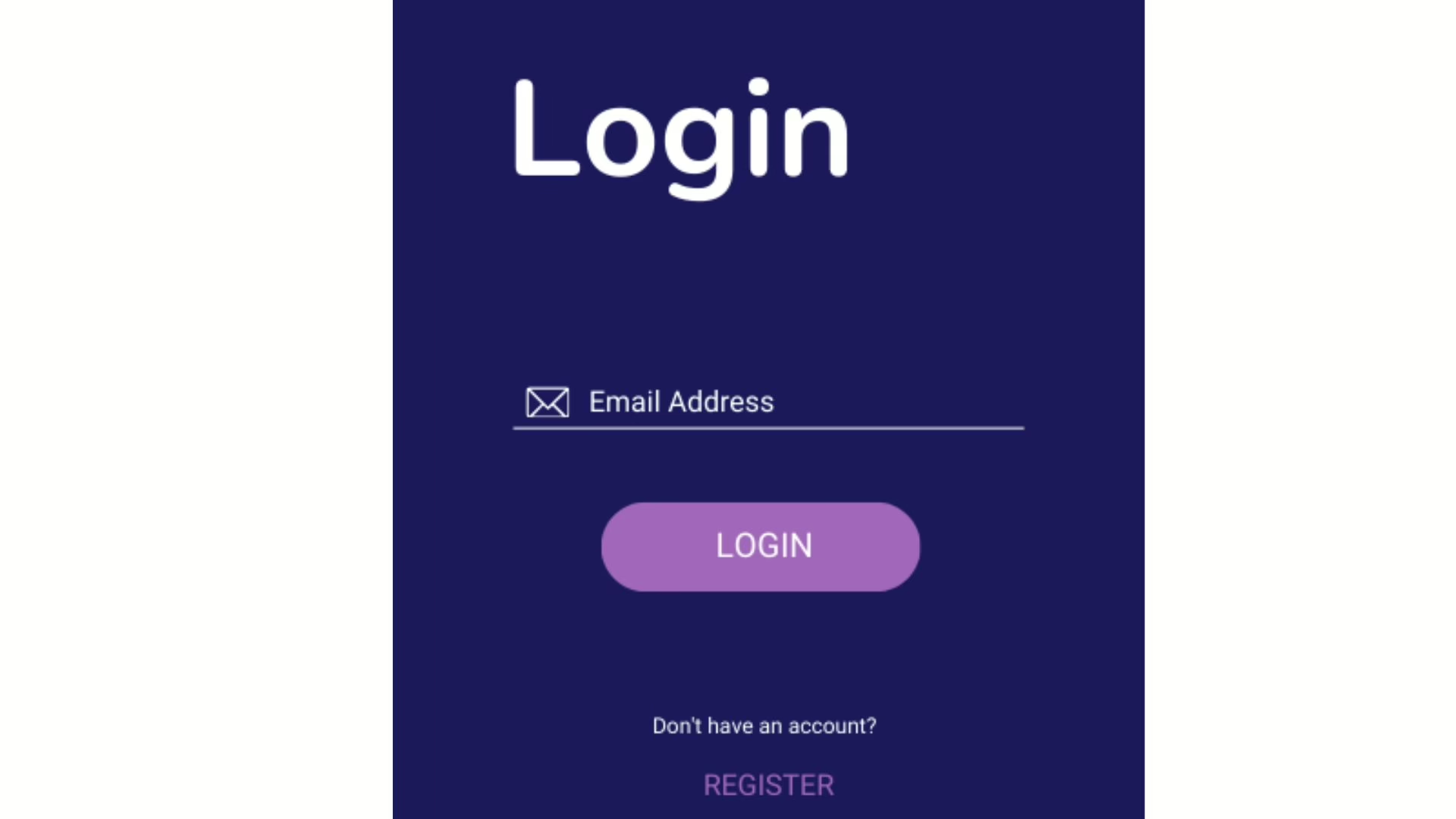
- Email Entry: The user begins by entering their email address into a text input field. This action is the first step in the login process.
- Login Request: When the user presses the “Login” button, the application sends a request to Firebase to trigger the sending of a verification email.
- User Feedback: As soon as the button is pressed, the button’s label changes from “Login” to “Tap link in email,” providing immediate feedback to the user. This indicates that their request is being processed and informs them about the next action they need to take—checking their email for the verification link.
- Button Inactivity and Countdown: After the user taps the login button, it becomes inactive for 120 seconds. During this time, a countdown timer is displayed, showing a message such as “Can resend in 120 secs.” This feature prevents users from repeatedly requesting verification emails within a short period, which enhances security and reduces server load.
Verification Link: Once the user receives the email containing a unique verification link and clicks it, their email address is verified, allowing them to proceed to log in to the app.
Key Components of the UI
For a seamless user experience, the UI must clearly reflect each step of the process. Here are the essential UI components we need to implement:
1. Email Input Field
- Description: This text field allows users to input their email addresses.
- Implementation Considerations:
- Validation: The field should validate the email format (e.g., ensuring the presence of “@” and a valid domain).
- Placeholder Text: Adding a placeholder such as “Enter your email” helps guide users on what to input.
2. Login Button
- Description: The button that initiates the email verification process.
- Initial State: Initially labeled “Login,” indicating its primary function.
- Post-Action State:
- Upon being clicked, the label changes to “Tap link in email,” providing immediate feedback to the user.
- The button becomes inactive for 120 seconds, preventing further clicks during this cooldown period.
3. Countdown Timer
- Description: A timer is displayed on the screen to inform users when they can resend the verification email.
- Functionality:
- After the login button is tapped, the countdown begins at 120 seconds.
- As the time decreases, the message updates dynamically (e.g., “Can resend in 119 secs,” “Can resend in 118 secs,” etc.), giving users real-time feedback on when they can try to resend the email.
- Once the countdown reaches zero, the button can be reactivated, allowing users to request another verification email if they haven’t received the first one.
4. Feedback Messages
- Description: Optional messages or tooltips can be incorporated to inform the user about the process.
- Purpose:
- These messages can clarify what the user should do after clicking the button, such as “Check your inbox for a verification link.”
- Providing additional context reduces user anxiety and confusion, helping them understand that they need to look for an email.
Visual Design Considerations
In addition to functional elements, the visual design of the UI plays a significant role in user engagement and satisfaction:
- Color and Contrast: The email input field and login button should be visually distinct, using colors that stand out against the background. A high contrast ensures accessibility and visibility.
- Animation: A subtle animation can be used when changing the button label or when the countdown starts. For example, a fade transition can help users notice the change without feeling rushed.
- Layout: Proper spacing and alignment of UI elements contribute to a clean and organized interface. Ensure that the email input field, login button, and countdown timer are clearly arranged for easy readability.
Enhancing User Experience
To further improve user experience during the email verification login process, consider these enhancements:
- Loading Indicator: If there’s a delay in sending the email, consider adding a loading indicator after the button is clicked. This informs the user that their request is being processed, reducing uncertainty.
- Error Handling: Implement error messages for common issues, such as if the email fails to send. Clear error messages help users understand what went wrong and how they can rectify it.
Conclusion
In this first part of our blog series, we focused on the system setup and the necessary UI changes required for implementing an email verification login process in our Flutter app. By providing immediate feedback through button label changes, disabling the button temporarily with a countdown timer, and guiding users on the next steps, we enhance the user experience significantly.
In the subsequent parts of this series, we will dive into setting up the SMTP mailer to send verification emails, configuring Firebase for the email verification process, creating snapshot listeners for real-time updates, and thoroughly testing the entire system to ensure functionality. By the end of this series, you will have a complete understanding of how to implement a secure and user-friendly email verification login system in your Flutter app.
We are committed to building secure and user-friendly solutions that exceed customer expectations. With a deep understanding of modern authentication techniques, our team ensures that every implementation—like the email verification login system—is robust, scalable, and aligned with your business objectives.
Let Sreyas help you transform your ideas into reality with unmatched technical expertise and a passion for excellence. Contact us today to take your app’s authentication and user experience to the next level!


