
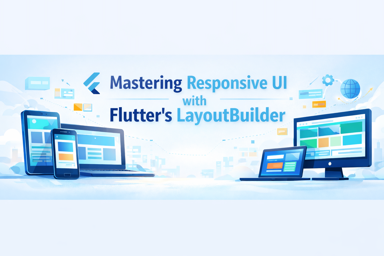
At Sreyas IT Solutions, we use Flutter’s LayoutBuilder to build responsive, adaptive UIs that deliver smooth, consistent experiences across mobile, tablet, and web.
What is LayoutBuilder?
LayoutBuilder is a Flutter widget that defines size constraints of its parent from where you can make different UI layouts depending on the space that is available. Without this tool, it would be impossible to create responsive designs that change their appearance according to the screen size or the device’s orientation.

Sample code:
import 'package:flutter/material.dart';

void main() => runApp(MyApp());

class MyApp extends StatelessWidget {
  @override
  Widget build(BuildContext context) {
    return MaterialApp(
      home: Scaffold(
        appBar: AppBar(title: Text('LayoutBuilder Example')),
        body: Center(
          child: LayoutBuilder(
            builder: (BuildContext context, BoxConstraints constraints) {
              if (constraints.maxWidth < 600) {
                // For small screens
                return Container(
                  color: Colors.blue,
                  width: 100,
                  height: 100,
                  child: Center(child: Text('Small Screen')),
                );
              } else {
                // For larger screens
                return Container(
                  color: Colors.green,
                  width: 200,
                  height: 200,
                  child: Center(child: Text('Large Screen')),
                );
              }
            },
          ),
        ),
      ),
    );
  }
}
Code Analysis:
- LayoutBuilder Widget
It is a widget that encapsulates a widget tree which changes according to the parent’s constraints.
- builder Function
- Provides two parameters:
- context → The build context.
- constraints → BoxConstraints of the parent widget.
- Responsive Check
- The available width is determined by constraints.maxWidth.
- It is possible to set various layouts for small, medium, or large screens.
- Dynamic Layout
Chooses different widgets (a small or large container) depending on the width of the screen.
- Use Cases
Adaptive grids, responsive cards, dynamic layouts in web, tablet, and mobile apps.
LayoutBuilder vs MediaQuery in Flutter
- Source of Information
- LayoutBuilder: Provides the size constraints of its parent widget at build time.
- MediaQuery: Provides overall device screen size, orientation, and other media info.
- Scope
- LayoutBuilder: Works locally based on parent widget constraints.
- MediaQuery: Works globally, reflecting the full screen dimensions and device properties.
- Use Case
- LayoutBuilder: Ideal for responsive widgets inside a layout, e.g., adjusting a container size based on available space.
- MediaQuery: Ideal for full-screen responsiveness, e.g., adapting layouts or font sizes based on screen width/height.
- Dynamic Layout
- LayoutBuilder: Can rebuild widgets dynamically when parent constraints change.
- MediaQuery: Gives static device information during the build and does not monitor parent constraints.
- Performance
- LayoutBuilder: More efficient for nested or specific layout adjustments.
- MediaQuery: Best for overall screen-level adjustments but less precise for nested layout changes.
- Example
- LayoutBuilder: Adjust a card width based on its parent container.
- MediaQuery: Adjust a widget’s font size based on total screen width.
Conclusion:
At Sreyas IT Solutions, our main focus is on developing responsive and adaptable Flutter applications that provide smooth user experience to the users on any device. The usage of LayoutBuilder is what makes our UIs be able to change dynamically with the different screen sizes thus giving them the same, best, and visually attractive layouts for mobile, tablet, and web platforms.