
Sreyas IT Solutions has always focused on delivering high-quality, visually appealing web applications that are both functional and responsive. As our client base grew and projects became more complex, we recognized the importance of having a consistent and efficient approach to styling our web interfaces. That’s when we began integrating Tailwind CSS, and the results have been remarkable.
When you’re building a website or web app, one of the biggest questions is: how do I make it look good without spending weeks writing custom CSS? That’s where Tailwind CSS comes in. It’s a modern way of styling your project that’s both powerful and surprisingly beginner-friendly. Even if you’re not a developer, this guide will help you understand the basics and why Tailwind can make life easier.
Tailwind CSS builds on the principles of traditional CSS while directly addressing many of its challenges, particularly around maintainability, scalability, and design consistency. By adopting Tailwind across various client projects, our team has significantly accelerated development, ensured uniform styling across pages, and delivered more responsive and visually appealing web interfaces.
In this blog, we’ll share how Sreyas IT Solutions leverages Tailwind CSS to streamline styling in React and Next.js applications — and why it’s become a cornerstone of our modern front-end development stack.
What is Tailwind CSS?
Tailwind CSS is a utility-first CSS framework. Unlike traditional frameworks like Bootstrap that give you pre-designed buttons, cards, and navbars, Tailwind gives you small styling tools (called utility classes) that you can mix and match to build your own unique design.
Think of it as a big toolbox. Instead of grabbing a fully built chair (like Bootstrap would give you), Tailwind gives you wood, nails, and a hammer so you can design the chair exactly how you want it. This makes your site more flexible, unique, and customizable.
With Tailwind, you don’t have to leave your HTML/JSX file to style things. You apply classes directly to your elements. For example:
Traditional CSS
.button {
  background-color: blue;
  padding: 10px;
  border-radius: 5px;
  color: white;
}
becomes:
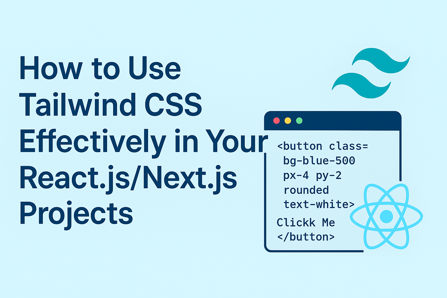
<button class="bg-blue-500 px-4 py-2 rounded text-white">Click Me</button>
Each little word (like bg-blue-500 or rounded) is a utility class that applies a small piece of styling. Stack them together and you get a complete design.
Why Use Tailwind with React & Next.js?
Tailwind for React.js and Next.js fits perfectly in because:
- Speed – You style elements directly in your component code.
- Consistency – No more slightly different shades of blue across your app.
- Responsive by default – Making your design mobile-friendly is as easy as adding prefixes like md: or lg:.
- Customization – Tailwind can be adjusted to match your unique brand.
Setting It Up
If you’re starting a Next.js project, here’s the flow:
- Create a project:
Run npx create-next-app my-site in your terminal. - Install Tailwind:
Run npm install tailwindcss postcss autoprefixer
npx tailwindcss init -p
- Connect Tailwind to your project:
In tailwind.config.js, tell Tailwind which files to scan:
content: [“./pages/**/*.{js,ts,jsx,tsx}”, “./components/**/*.{js,ts,jsx,tsx}”] - Import Tailwind’s base styles:
In styles/globals.css, add:
@tailwind base;
@tailwind components;
@tailwind utilities;
That’s it! Now you can start using Tailwind classes in your React components.
How to Use Tailwind Effectively
Here are some practical tips:
1. Think in Lego Blocks
Each Tailwind class is a small piece of style. Combine them like Lego pieces to create unique designs without custom CSS.
2. Stay Consistent
Instead of typing random pixel values everywhere, use Tailwind’s design system. For example, p-4 always means 1rem padding.
3. Mobile-First Made Easy
Add prefixes for screen sizes. Example:
<div class="text-sm md:text-lg lg:text-xl">Responsive Text</div>
This text gets larger on tablets (md) and desktops (lg).
4. Extract Reusable Components
If you find yourself repeating long class lists, make a React component for it:
const Button = ({ children }) => (<button className="bg-blue-500 hover:bg-blue-600 text-white px-4 py-2 rounded"> {children}</button>
);
5. Use Dark Mode
Tailwind has built-in dark mode support. Just add dark: before any class:<div class="bg-white dark:bg-black text-black dark:text-white">Hello</div>
Conclusion
Tailwind CSS is not just for developers — it’s a design system that makes building beautiful, consistent, and responsive websites simpler. If you’re working with React or Next.js, it can save hours of styling work and help your project look polished right away.
Whether you’re a beginner or a pro, think of Tailwind as your toolbox of styles. Just pick the pieces you need, put them together, and watch your design come alive.