
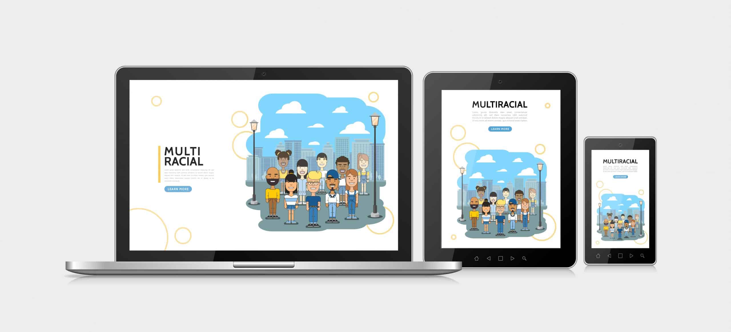
Sreyas IT Solutions has extensive experience in custom Flutter applications development services tailored to various business needs. Our expertise spans creating highly responsive and adaptive user interfaces that provide seamless experiences across different devices, including mobile, tablet, and web platforms. By leveraging Flutter’s powerful tools, such as MediaQuery, we ensure that applications automatically adjust to various screen sizes, orientations, and device characteristics. This documentation provides a detailed guide on using MediaQuery to create a responsive layout in Flutter applications.
What is MediaQuery For Custom Flutter Applications Development Services?
MediaQuery is a class for custom Flutter applications services that provides information about the device’s screen, including:
- Screen dimensions (width and height)
- Screen orientation (portrait or landscape)
- Pixel density
- Text scaling factor
- Device padding (such as the system status bar or navigation bar)
With this information, you can adjust your app’s layout to ensure it looks good on any screen size.
Example code:
Here’s how you can use MediaQuery in Flutter to handle mobile, tablet, and web views using a ternary operator:
import 'package:flutter/material.dart';

void main() {
  runApp(MyApp());
}

class MyApp extends StatelessWidget {
  @override
  Widget build(BuildContext context) {
    // Get screen width using MediaQuery
    double width = MediaQuery.of(context).size.width;

    // Check if the screen size is mobile, tablet, or web
    bool isMobile = width < 600; // Mobile: width less than 600px
    bool isTablet = width >= 600 && width < 1200; // Tablet: width between 600px and 1200px
    bool isWeb = width >= 1200; // Web: width greater than or equal to 1200px

    return MaterialApp(
      home: Scaffold(
        appBar: AppBar(title: Text('Responsive UI Example')),
        body: Center(
          child: Container(
            width: isMobile
                ? width * 0.8 // 80% of the width for mobile
                : isTablet
                    ? width * 0.6 // 60% of the width for tablet
                    : width * 0.4, // 40% of the width for web
            height: 200,
            color: Colors.blue,
            child: Center(
              child: Text(
                'Screen Width: $width\nMobile: $isMobile\nTablet: $isTablet\nWeb: $isWeb',
                textAlign: TextAlign.center,
                style: TextStyle(color: Colors.white),
              ),
            ),
          ),
        ),
      ),
    );
  }
}
Explanation of the code:
- MediaQuery.of(context) returns the MediaQueryData object, which contains details about the current device, such as screen size, pixel density, and more.
- .size.width retrieves the width of the screen, which is used to determine if the device is a mobile, tablet, or web.
- bool isMobile = width < 600; // Mobile: width less than 600px
bool isTablet = width >= 600 && width < 1200; // Tablet: width between 600px and 1200px
bool isWeb = width >= 1200; // Web: width greater than or equal to 1200px
Mobile: This boolean variable is set to true if the screen width is less than 600px, indicating the device is a mobile.
Tablet: This boolean variable is set to true if the screen width is between 600px and 1200px, indicating the device is a tablet.
Web: This boolean variable is set to true if the screen width is 1200px or greater, indicating the device is a web device (such as a desktop or laptop).
Width Calculation Using Ternary Operator:
The width of the Container is determined by the ternary operator. The screen width (width) is adjusted based on whether the device is mobile, tablet, or web.
- If isMobile is true, the width is set to 80% of the screen width (width*0.8).
- If isTablet is true, the width is set to 60% of the screen width (width*0.6).
- If isWeb is true, the width is set to 40% of the screen width (width*0.4).
Advanced Use Cases:
Dynamic Padding Based on Device Properties:
You can also get the padding around the screen, such as the system status bar or navigation bar:
- EdgeInsets padding = MediaQuery.of(context).padding;
Use this to adjust widget positioning so they don’t overlap with system UI elements.
Checking Device Pixel Density:
Flutter allows you to retrieve the device’s pixel density, which can be useful for rendering high-quality images or adjusting layout density:
- double devicePixelRatio = MediaQuery.of(context).devicePixelRatio;
Use this value to ensure that images and content appear crisp on devices with higher pixel densities.
Conclusion :
MediaQuery is a fundamental tool in Flutter for building responsive UIs that adapt to different screen sizes, orientations, and device characteristics. By leveraging the screen size, orientation, and other properties, you can create layouts that look great across a wide range of devices.
At Sreyas IT Solutions, we specialize in developing highly scalable and adaptive custom Flutter applications development services to ensure a seamless user experience. By incorporating MediaQuery, you can build apps that offer a consistent and optimized experience on phones, tablets, and other devices with varying screen dimensions.